Orchard Cottage Dental
One of the highest-performing practices in the Enamel Dental group. With 246 Excellent reviews and a reputation built on genuine patient care, they needed a website that lived up to the standard they'd set in person.
- Role
- Web design and build, treatment landing pages
- Client
- Dental practice in Lightwater, Surrey (Enamel Dental group)
- Platform
- WordPress
The challenge
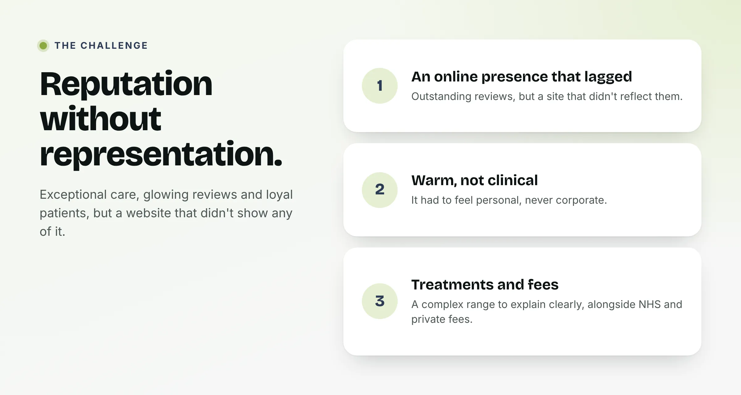
Orchard Cottage Dental had everything going for them: an exceptional team, glowing reviews and a loyal patient base built over years of genuinely outstanding care.
What they needed was a website that communicated all of that clearly and confidently to anyone discovering them for the first time. A practice this well regarded deserves a digital presence that does it justice.
My role
Web design and build
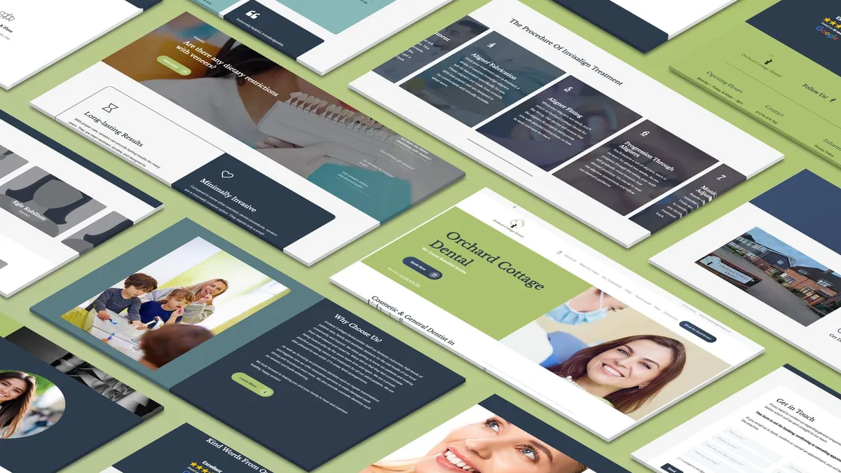
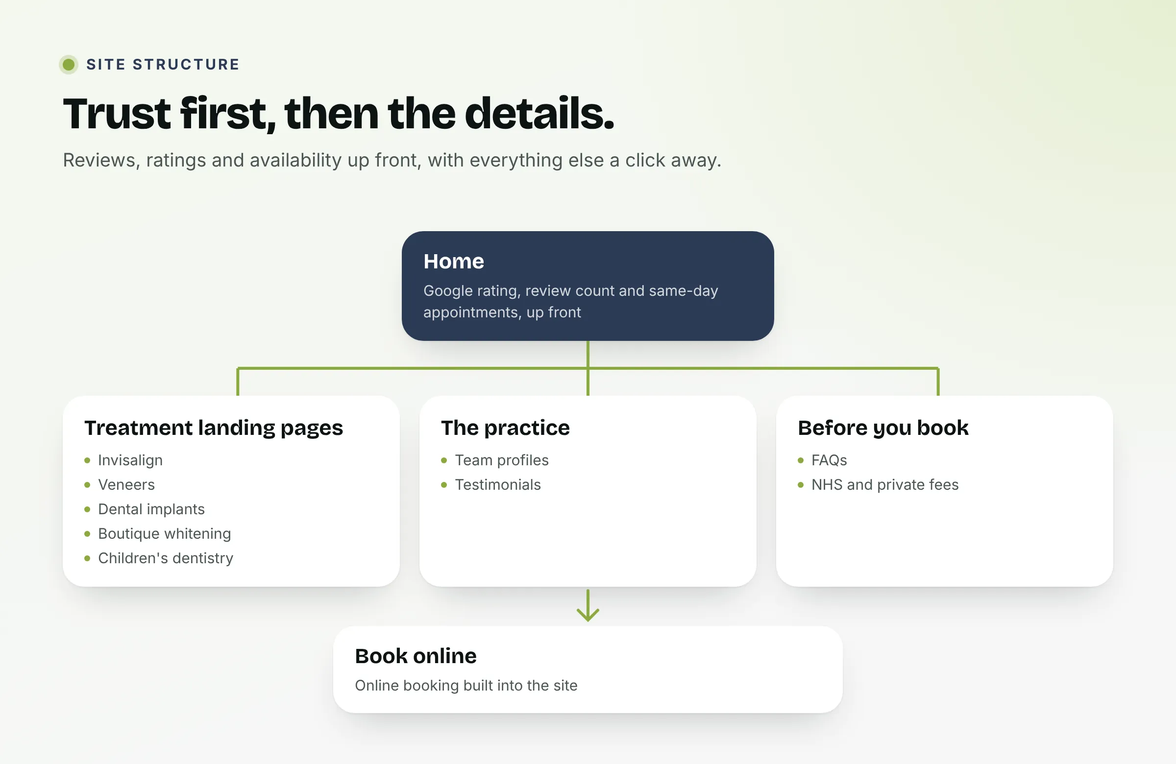
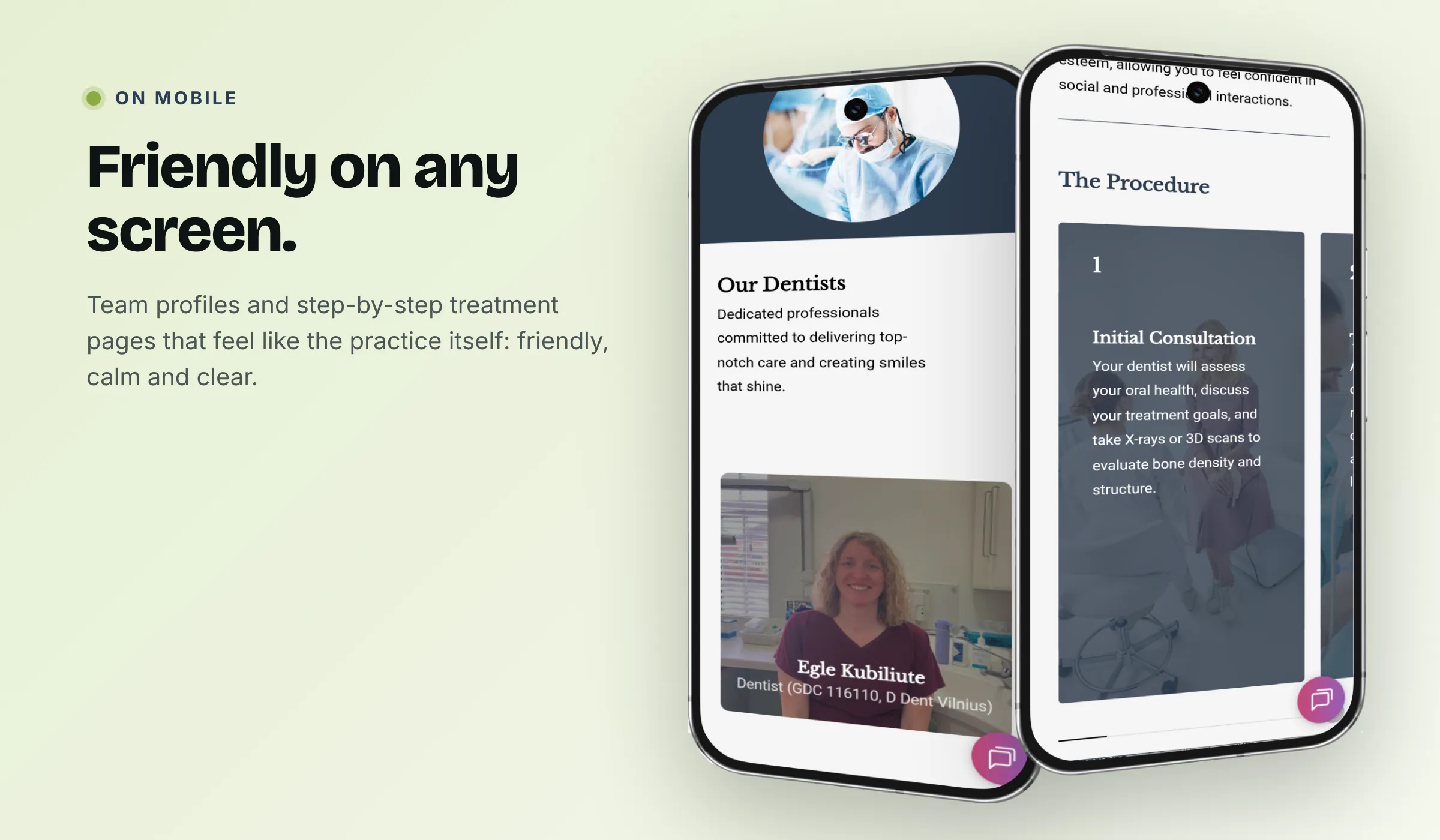
I designed and built the full website: home page, treatment pages, team profiles, testimonials, FAQs, fees and online booking, balancing professionalism with the warmth the practice is known for.
Treatment landing pages
I built dedicated landing pages for key treatments, including Invisalign, veneers, dental implants, boutique whitening and children's dentistry, each structured to inform and convert.
Design strategy
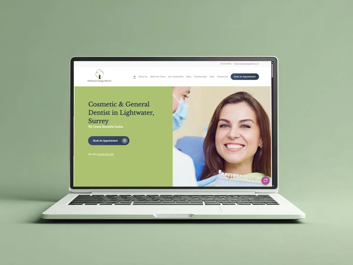
With a practice this well regarded, the design job was partly about getting out of the way and letting the brand speak. I led with trust signals from the start (the Google rating, patient review count and same-day appointment availability) because when so much of the decision is emotional, confidence needs to be established immediately.
Copy across the site was kept clear, warm and jargon-free throughout.
- Trust signals front and centre: reviews, ratings and availability visible immediately.
- Warm, plain-English copy that makes treatments feel accessible, not intimidating.
- NHS and private fees presented clearly, so there are no surprises.
The results
- Excellent reviews, now front and centre
- 246
- treatment landing pages
- 5
- place for NHS and private fees
- 1
Trust at first glance
The Google rating, review count and same-day appointment availability greet every visitor, so the practice's reputation does the talking from the first scroll.
Treatments made approachable
Dedicated pages for Invisalign, veneers, implants, whitening and children's dentistry explain each option in plain English, with a clear route to book.
Fees without the fog
NHS and private fees sit together in one clear place, answering the question many patients are too shy to ask.
Carried into the next project
Lessons learned
Lead with proof
When a practice is this well loved, the strongest design move is putting that love where people see it first: the ratings and reviews, before anything else.
Warmth is in the words
Plain-English copy did as much as colour and imagery to make treatments feel approachable rather than clinical.
Answer the awkward questions
Being upfront about fees and NHS availability builds trust faster than any headline.